
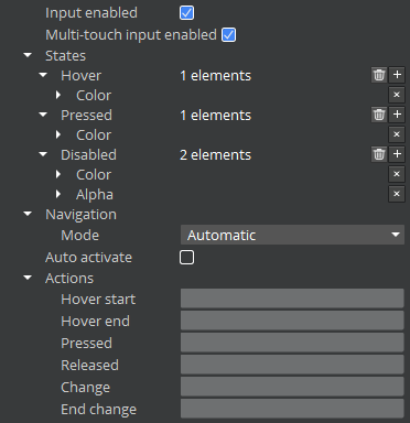
Interactive Component Properties
All of the interactive components share a common set of properties. These properties are grouped into the following categories:
- Input Enabled - Check box or flag that determines whether the element can be interacted with.
- Multi-Touch Input Enabled - Check box or flag that determines whether the element will handle multi-touch events. Requires multi-touch to be enabled on the parent UI canvas (enabled by default).
- States - Settings that determine the appearance of the element when in the Hover, Pressed, or Disabled states.
- Navigation - Settings that determine how the gamepad or arrow keys navigate between interactive elements.
- Auto Activate - Check box or flag that determines whether the element is automatically activated when the player pauses on the element.
- Actions - Events that are caused by the listed action.
Input Enabled
The Input Enabled setting determines whether the component can be interacted with in O3DE.
Multi-Touch Input Enabled
The Multi-Touch Input Enabled setting determines whether the component will handle multi-touch events in O3DE.
States
The States group of properties defines the appearance of the interactive element and its child UI elements in O3DE.
Navigation
Use the Navigation group of properties to specify how the arrow keys or gamepad navigates between interactive elements in O3DE.
Auto Activate
Enable Auto Activate for interactive elements in O3DE UI Editor to set an element to activate automatically.
Actions
Use the Actions properties in O3DE UI Editor to trigger an event when one of the listed actions occur.